WOODY AND THE BIG TREE
As in many other cases in this story, I drew upon an idea inspired from my own life. My wife back then had green thumbs and a beech tree in our front yard grew to a considerable size over the years. I am looking at it right now, and it is by far the biggest tree in the entire neighborhood.
When contributing to the Scandinavian Woody Woodpecker monthly I had an ambition to blend the episodes with Woody and my installments with Gnuff to work as reports from the same town where they both were supposed to live.
I did four episodes with Woody on his problems with a wild growing big tree and four episodes with Gnuff on a similar theme. They were presented in shifting order, since I had a deal to contribute with both series on a 50/50 basis. To pull off this intertwining storytelling work I had to have a parallel to the mayor, Wally Walrus. This role was in the Gnuff series played by the council Chairman Siegel. In one panel in the first episode, I let Wally Walrus meet the street sweeper Gnuff, but only in silhouette. My own character, P. P. Phrogg I used both with Woody and the Gnuffs.
The Gnuff and Woody stories share some locations. The town hall is the same and Woody as a museum custodian arranges an exhibition where Gnicky gets to be a visitor. The park with Picus Tower refer to both partitions as well as some other places in Pecktown. The adventurer Tor Dreyerhall is modelled after the Norwegian explorer Thor Heyerdal, who always look around for a reason to build yet another raft, by which he can claim to demonstrate some possible migration routes over the sea many years ago. It is evident that the sailing bit is the main thing and that the historical thesis is mostly an excuse to find sponsorship to his projects.
Put together the two intrigues feature album length stories, and I present them both hereby in English. The Gnuff part called ‘The Giant Trees’ deals with a whole number of giant coal age trees revived today. You can see that I concentrate on Woody’s personal trouble in his version of that theme, whereas the Gnuff angle encompasses more of the problems for the society around them.
This goes to show the versatility of funny animal comics. The Woody concept is clearly more for children, whereas the Gnuff treatment shows an adolescent approach. The Semic publishers preferred the Woody kind of stories, maybe an explanation why my first two intertwined Gnuff albums took so long time before coprinted in the Scandinavian countries.
Looking back, I am glad that I was more ambitious than my publisher was, because it is the stories with more complexity that decides my eventual claim to any fame retrospectively. Also looking back I can see, that the advances and nuanced stories are forerunners for what I express nowadays with literature, where the audience are willing to accept a more demanding story presentation.
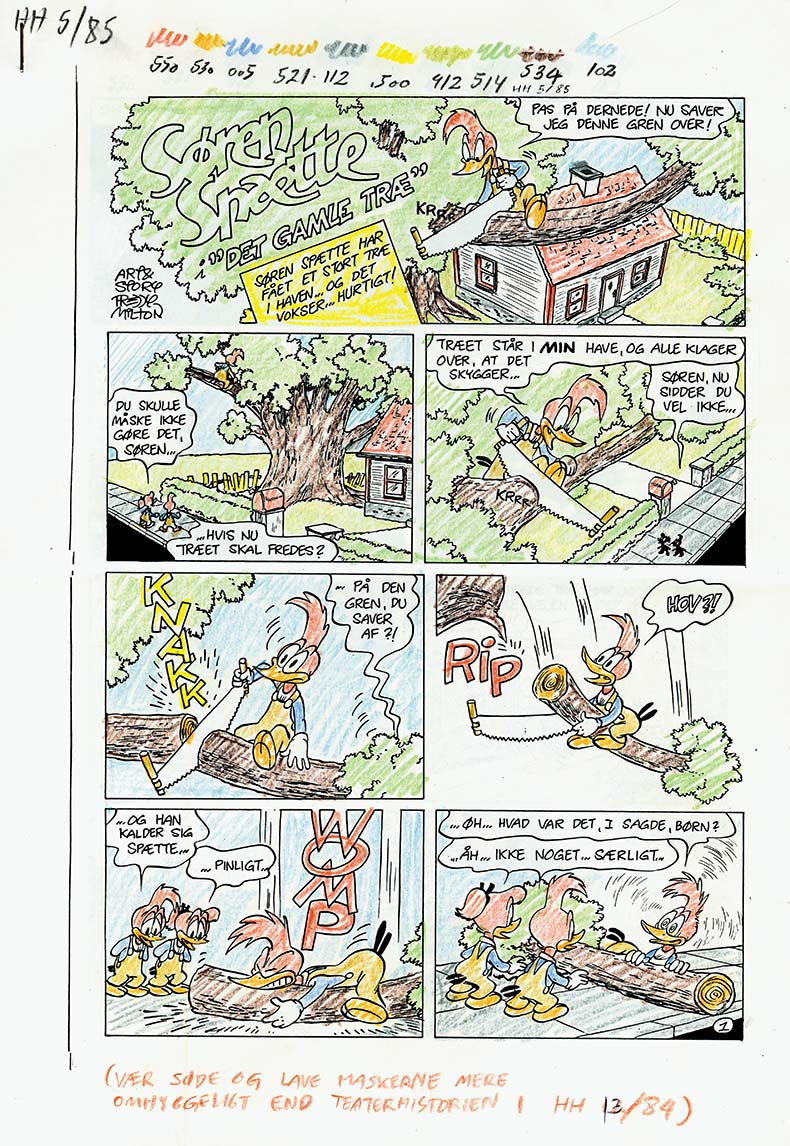
The intro picture present a color indication for the OK Press studio south of Copenhagen. They did technical coloring for Semic Press in the pre-digital days, and I wanted to get the most out of the 10 colors being the limit of what I could ask for.
As you can see, I asked for colors blended from all three basic printing colors Yellow, Red and Blue. I was even shrewd enough to add yellow to the red color, even though this was not necessary for the magazine print, where the color red was good enough in itself. However I foresaw a more durable album version to come out later, and there I knew the red printing color would be the ghastly magenta looking horrible if unblended with yellow.
I managed by demand to train the coloring girls to present a more ambitions looking work than they would have done without my insisting upon it. Of course, they were low paid and usually did not present color films with nuances blended from all three printing colors.
One more thing you can notice is the difficulty this old newspaper print had in keeping an exact registration. Sometimes the colors do not follow the lines precisely. This is an element of imperfection also looked upon with acceptance by the fans. Something like the nostalgic scratching when playing old vinyl records…
When the technical coloring staff in 1957 shifted to rotogravure on the Disney comics they did not compensate for the shift of basic colors in the RGB scale. In that magazine as kids we then saw to our disgust lots of ugly magenta colors filling the pages in a horrendous palette, where also the unblended blue (cyan) did not look natural in our eyes. What the heck, only meant for kids, you could get away with doing an easy coloring job. Maybe the editors didn’t even know it could be done differently. At least I remembered and made certain that my comics came to look better.
This story was never reprinted as an album. Being in the last days of profitability of for the Woody comics the two middle episodes were not even published in the Danish Woody magazine, only in Norway and Sweden. Through my career as a comic artist and writer, I found myself on the brink of profitability and managed to take advantage of the last opportunities in the field to get something out before magazines folded or production plans were shelved. Jumping from one piece of ice to the next going down the river towards the waterfall comes to my mind as a valid picture of the situation of many comics artists at the time.